Suppose you have a sales report for each month for a year, and you want to see how the sales performed in each month. Whether the sales were high, average, or low? Or maybe you are a teacher and want to see how many students performed exceptionally well, average or poor.
Well, a histogram is an effortless way to visualize data and makes it easier to interpret the data. It is a graph that represents how data is distributed.
Histogram graphs can be plotted easily using Google sheets, which is a spreadsheet program included as part of a free, web-based software office suite offered by Google within its Google Drive service.
So let’s learn how we can quickly plot these informative charts in a few minutes.
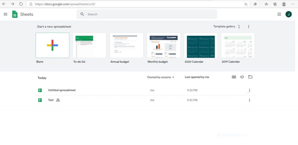
Step 1:- Open Google Sheet by clicking below url
Go to https://docs.google.com/spreadsheets/u/0/
You will see a page like the one shown in Fig. 1 below
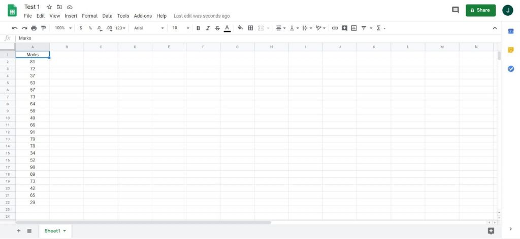
Step 2:- Open New Spreadsheet
Open a new spreadsheet by clicking on “Blank”. To understand the histogram graph plotting steps let’s take an example where there are 21 students in a class and you want to plot the histogram to see the distribution of marks of the students.
Maybe you would like to divide the student in performance as High performers, Good performers, Average performance, poor performance, and very poor performance, etc. You need to copy or type all the data in a column in the blank spreadsheet as shown in Fig. 2
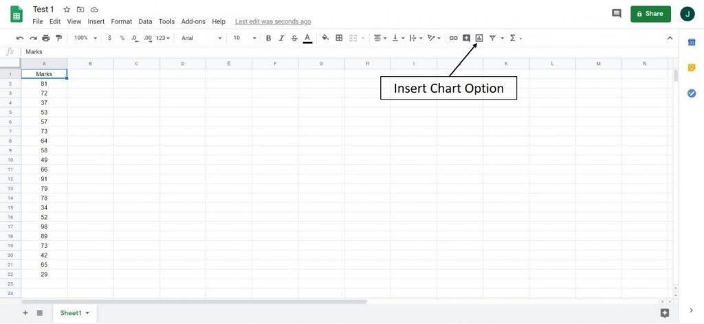
Step 3:- Setup Histogram
Once the data is put in one column in the sheet, click on the symbol for the “Insert chart” option as shown in Fig.3. One word of caution here is that you have to make sure that one of the elements in the column has been selected (represented by the blue rectangle in Fig.3.)
Step 4:- Insert Chart
Once you click the button for the “Insert chart” option, this will either create a histogram, if it is set as default chart or it will give an option of plotting different charts in the “Chart editor”.
You can select the histogram from this list (if not set as default). This is shown in Fig. 4 below. The Chart editor has two options – Setup and Customize as shown.
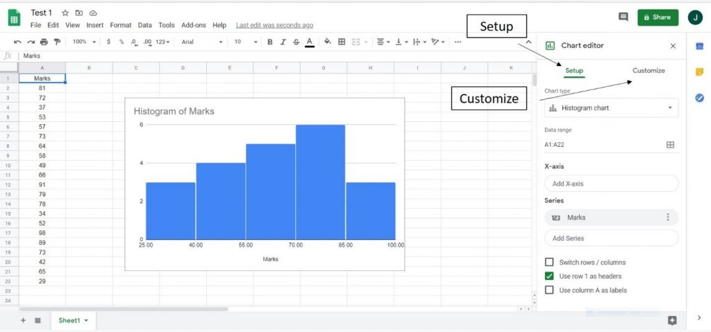
Step 5:– Setup Histogram
Setup has many options like Chart type, Data range, X-axis, and Series as shown in Fig.4. The Chart type is “Histogram”, Data range is from A1: A22 meaning column A has been selected with rows from 1 to 22.
This data range can be modified, for example, if you want to plot the histogram for the first 15 values then you can put here A1: A16. The series tab lets you choose the bar color for each series in your histogram in case if you have a histogram comparing multiple series.
You will get many options to modify the Histogram based on your needs from the option “Customize” as shown in Fig.5 below. The options are namely Chart Style, Histogram, Chart and Axis Titles, Series, Legend, Horizontal axis, Vertical Axis and Gridlines, and Ticks.
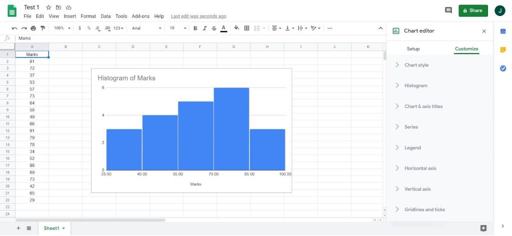
Fig.5
Step 6:- Customize Histogram
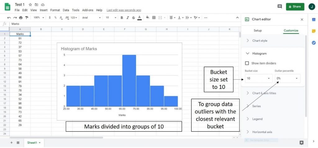
Under Chart style, there are options like Background color, Font style, and Chart border color. The second option, ‘Histogram’ is important and has two further sub-options- Bucket and Outlier Percentile.
These options are shown in Fig.6. Bucket size by default is set as Auto. Bucket size means how many of the data points are put in one bar of the histogram.
It can be changed from 1, 2, 5, 10, 25, and 50. So for example, if you change the bucket size to 10, it will divide the marks into groups or buckets of 10 marks. This is shown in Fig.6. To group data outliers with the closest relevant bucket, the outlier percentile option could be selected.
Step 7:- Use Legend Option
Under the option of Chart and axis title, there are various options where you can put the title of the chart, its font style, font size, and text color, etc. The option ‘Series’ could be used if there is more than one set of datasets.
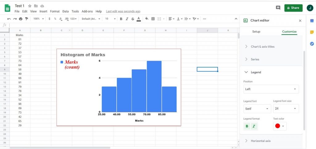
With the legend option, you can put a legend on the graph and the legend can be modified for the position of legend, font, size, and color of the legend. Fig.7 shows an example legend placed on the left of the graph with font-size ‘serif’, size 24, Bold, Italics, and a red color text.
The vertical and horizontal axis options help in modifying the labels of the vertical and horizontal axis. Similarly, the last option helps in putting gridlines in the graph.
Step 8:- Compare Data Set
Finally, if you have more than two sets of data for example Marks for 2 different subjects, it can also be plotted using the above steps. An example is shown in Fig. 8
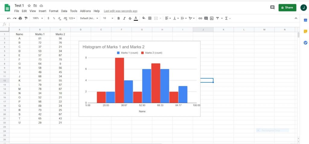
Fig.8
Happy Histogram plotting!
