Adding charts can beautify the presentations. PowerPoint allows a wide range of data representation. Bar charts, graphs, and pie charts are a few examples.

What is a graph or a chart?
A chart is a graphical representation of data for visual evaluation. With the help of diagrams, data is more comprehensive and consumable. To show decline or rise trends, It is convenient to use diagrams and compare the properties of objects, processes, phenomena, etc. by several parameters. The diagram allows data to be consumed easily, without diving into the numbers.
Different charts and graphs available on PowerPoint
Column Charts

Column charts use vertical and horizontal bars to represent data. The column size is proportionate to the data they reflect. Column charts are useful to represent different types of data but are most commonly used to compare the information.
Line Charts

Line charts are ideal for displaying trends. The data points are connected by lines, making it easy to comprehend if the values increase or decrease over time.
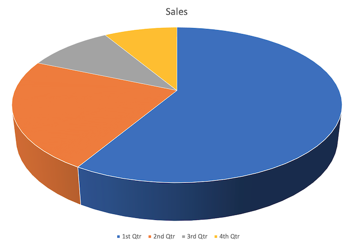
Pie Charts

Pie charts make it easy to compare data present per percentage. Each value appears as a slice of a round pie, so it’s easy to see which values are bigger in percentage.
Area Charts

Area charts are similar to line charts, except that area charts are filled with color under the lines. Area charts are helpful to observe the contribution of each of the elements.
Surface Chart

Surface charts allow us to display data in three-dimensional space. It works best with large datasets, allowing us to see a variety of information at the same time.
Charts and Graphs in PowerPoint
The chart created in PowerPoint is used as a media file that you can dynamically change at any time. It is extremely convenient. In the latter part of the article, we will see the details of setting up the dynamic graphs and charts. Before that, let’s see how to insert a simple chart into the Powerpoint presentation.
How to insert the chart/graph in PowerPoint Presentation
This is the fastest and easiest way to insert a graph/chart into a PowerPoint slide.
Create a new slide, the default layout has one heading area and one text area. Select insert from the main menu, ribbon pops up with options to add different objects.
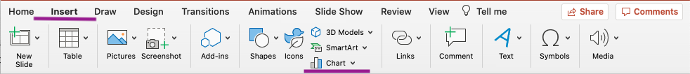
Select the chart as shown in the picture below. The left side contains different types of available charts. Select the type of the desired ppt chart, you want to insert into the presentation. The right menu pops up with a graphical style for specific graph types.
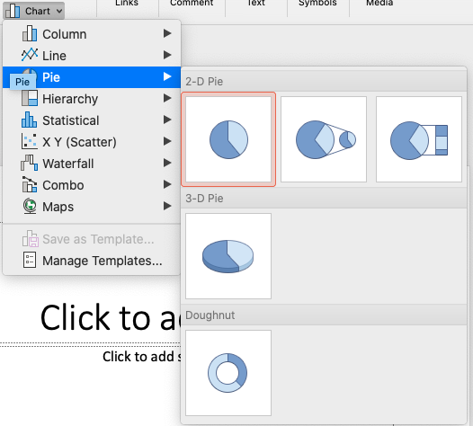
Select the ppt chart you want to insert and enter the data in the excel popup. This method allows us to quickly insert the ppt chart/ ppt graph in a PowerPoint presentation, but it takes the entire text area.
How to insert charts/graphs in PowerPoint Presentation from Excel Data
If the chart/graph is already created in excel, there is nothing that could stop you to insert that graph in PowerPoint from an already created excel sheet.
Create a new slide, the default layout has one heading area and one text area. Select insert from the main menu, ribbon pops up with options to add different objects.
Select the object and click on the “From File” button at the bottom-left of the box. Browse the file or enter the path manually to the desired excel sheet.
This option will add the existing table and charts to the PowerPoint slide.
This method is convenient for importing existing graphs from excel files to PowerPoint presentations. You can link the graph to the table in Excel. Changing the values in Excel will also change the graph in the presentation.
How to link a ppt chart or a ppt graph to data in Excel
Create a chart or graph in Excel, and copy and paste it into a PowerPoint presentation. If the data is changed in the excel file after the presentation is prepared, you can refresh the chart in PowerPoint by using the “Refresh Data” command.
For more information about inserting Excel charts and graphs into your PowerPoint presentation, see Copy an Excel chart to PowerPoint presentation.
Note: If you want to automatically update the data in a presentation, save the Excel file before inserting the ppt chart or ppt graph.
In Excel, select the chart by clicking it, select the Home tab, and in the Clipboard group, click Cut.
In PowerPoint, click a placeholder on the slide, on the Home tab, in the Clipboard group, click the arrow below the Paste button, and then click Paste.
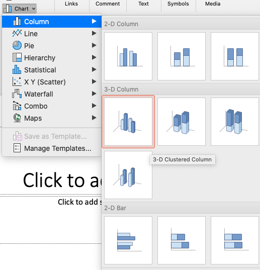
How can I change the type of chart in a PowerPoint Chart
PowerPoint makes it very convenient to switch to different charts with a single click.
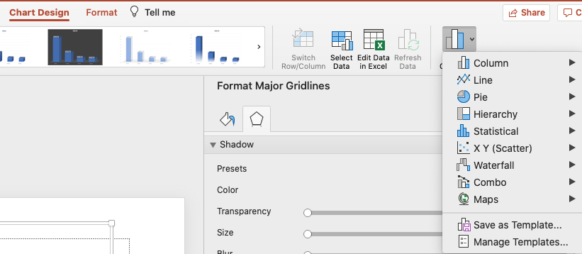
Click on the chart you want to change. Select “Chart Design” from the top menu. Click on “Change Chart Type” and select the appropriate chart.
How can I swap rows and columns in a PowerPoint Graph
Sometimes it is needed to change the axis of the data. Here is how you can swap rows and columns in ppt charts.
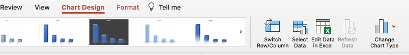
Click on the chart you want to change. Select “Chart Design” from the top menu. Click “Edit Data in Excel”. This will enable the option “Switch Row/Column”. To swap row and column, select “Switch Row/Column”.
How can I change the layout of the PowerPoint presentation
PowerPoint comes with ready-made chart layouts. Various layouts are prepared in order to find the best option for conveniently positioning all the elements on the diagram. So, in order to change the chart layout:
Click on the chart you want to change. Select “Chart Design” from the top menu. Click “Quick Layout” and choose the layout that fits best with your ppt chart.
