What is a Waterfall Chart in Excel?
A Waterfall chart is a wonderful way to visualize running total values. It is also known as a bridge chart or a cascade chart. The other names for a waterfall chart include the flying bricks chart or the Mario chart.

It analyzes the cumulative impact of values when they are added or subtracted from an initial total to arrive at a final total. For example: –
Closing Balance = Opening Balance + Addition + Movement + Reclassification + Discovery + Extension + Production
The gradual positive or negative changes in the intermediate values will impact the total of the closing balance
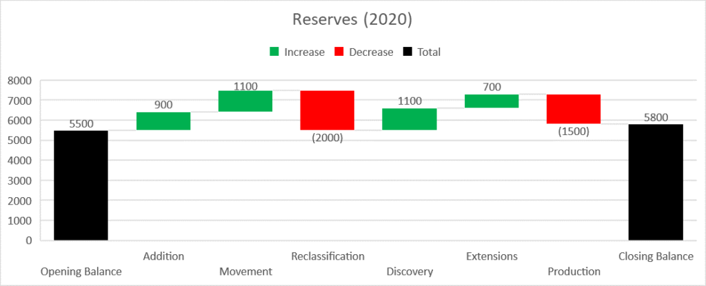
The picture above depicts the opening balance and closing balance of reserves for a company. The net reserves increased by 300 (5800 – 5500). The net increase in reserves could be attributed to various reasons line Addition, Movement or Reclassification, etc… The Opening Balance and Closing Balance values are also called total values.
Application of Waterfall Chart in Excel
A Waterfall chart has many applications including data visualization and analysis of complex problems. Finance is one of the main sectors where Waterfall charts are used extensively to understand the effect of positive and negative values on the net results. For example: to calculate the net revenue and further to arrive at the final profit of the company, a lot of investments, and fixed and variable operating costs will have to be deducted. A waterfall chart can be used here to find out the cumulative impact of these costs on the total profitability of the company.
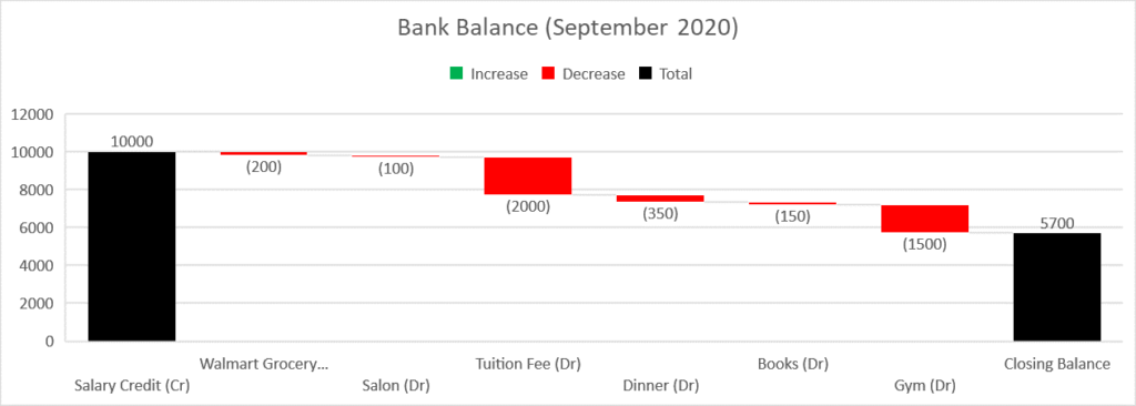
Another example where a Waterfall chart can be effectively used could be tracking your expenses. For example, you can use a waterfall chart to arrive at the balance in your bank account at the end of the month by subtracting all the expenses from your opening balance at the beginning of the month. The picture below depicts a simple example.
How to create a Waterfall Chart in Microsoft Excel?
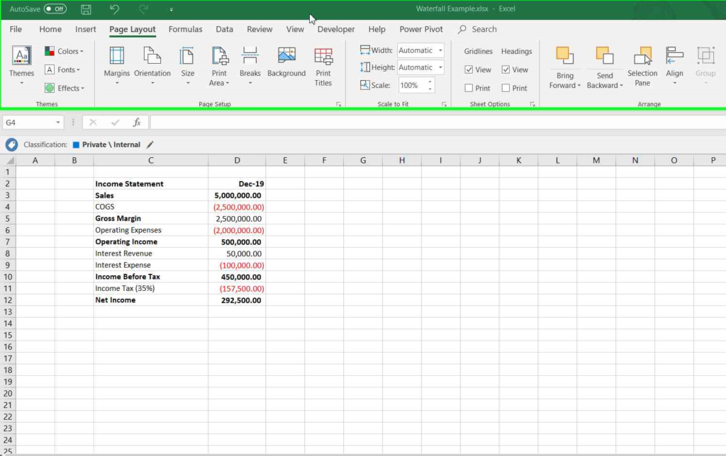
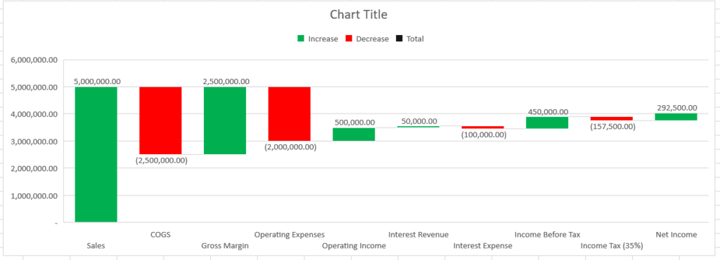
This article describes the creation of a Waterfall chart in Excel 2016. The picture below depicts the calculation of net income for the year 2019.
Steps to create a Waterfall chart in Excel 2016:
- Launch the excel file with data
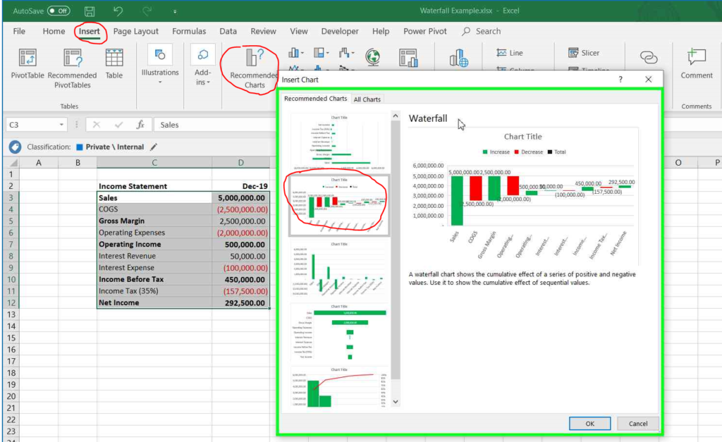
- Select the data and click on “Insert” from the menu and click on “Recommended Charts” option. Select “Waterfall” from the list. Click OK.
- The default chart will be displayed in the excel worksheet.
- The Totals and major sub-totals are represented by full columns. For example:
- Totals include Sales and Net Income
- Major Sub-Totals include Gross Margin, Operating Income, Income Before Tax
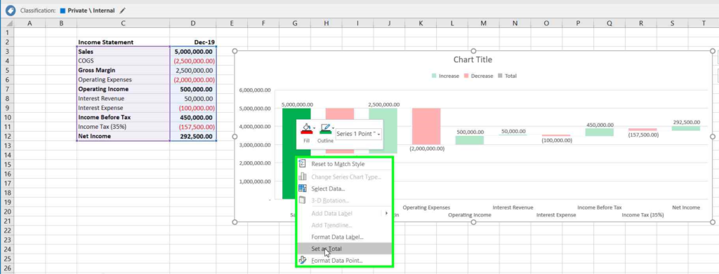
- Right click on the Totals and Sub-Totals and click on the “Set Total” option from the menu.
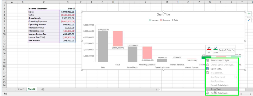
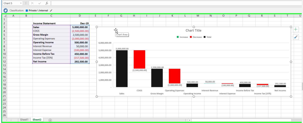
- The Totals and major-sub totals will be represented now as full columns.

- The default color applied to the “Increase”, “Decrease” and “Total” can also be customized by creating a new color scheme.
- Click on “Page Layout” from the menu. Click on “Colors” from the “Theme”. Click on “Customize Colors”
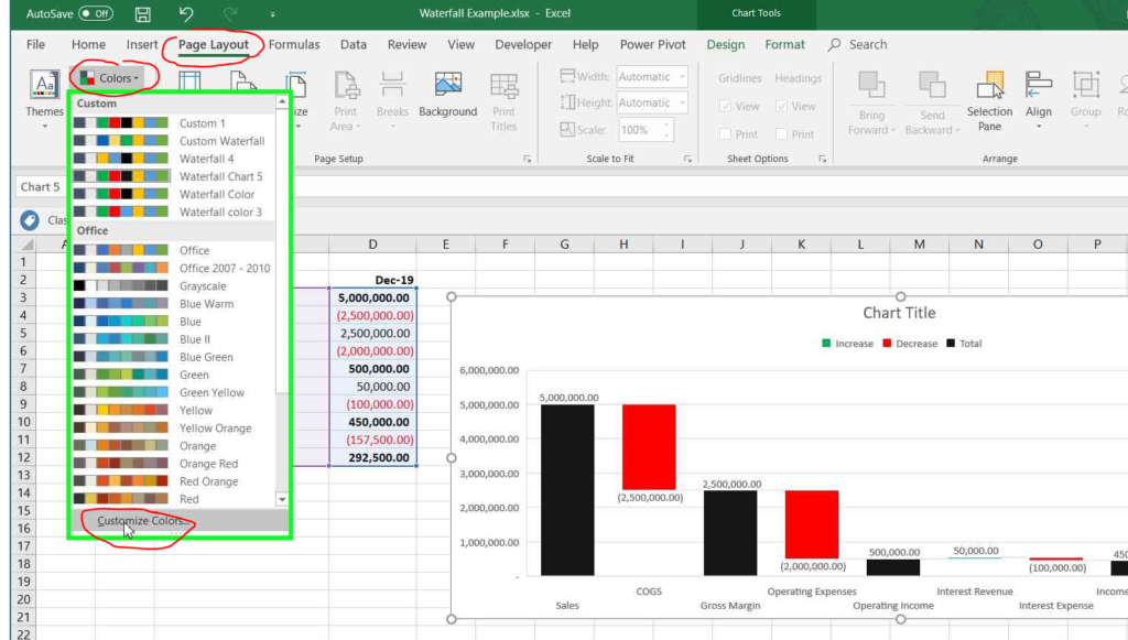
- Assign different colors to Accent 1 (Increase), Accent 2 (Decrease), and Accent 3 (Total).
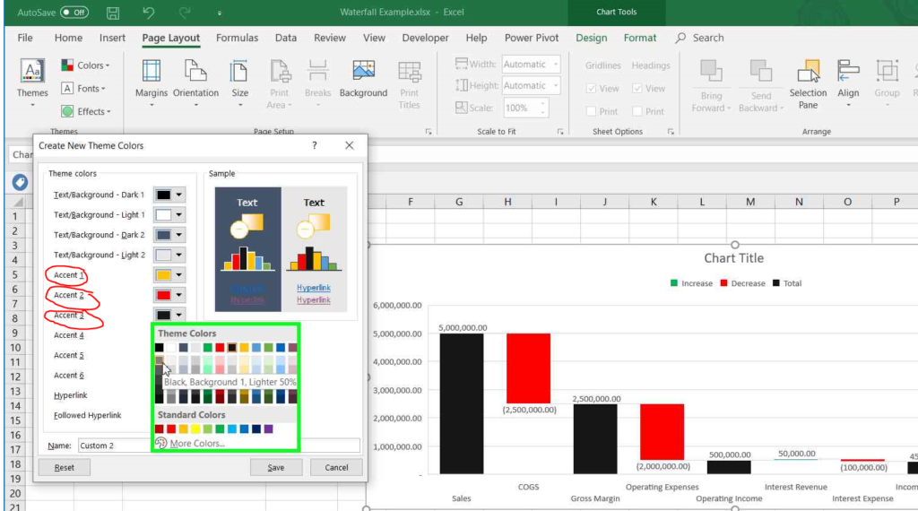
- The new color theme will be applied to the chart.
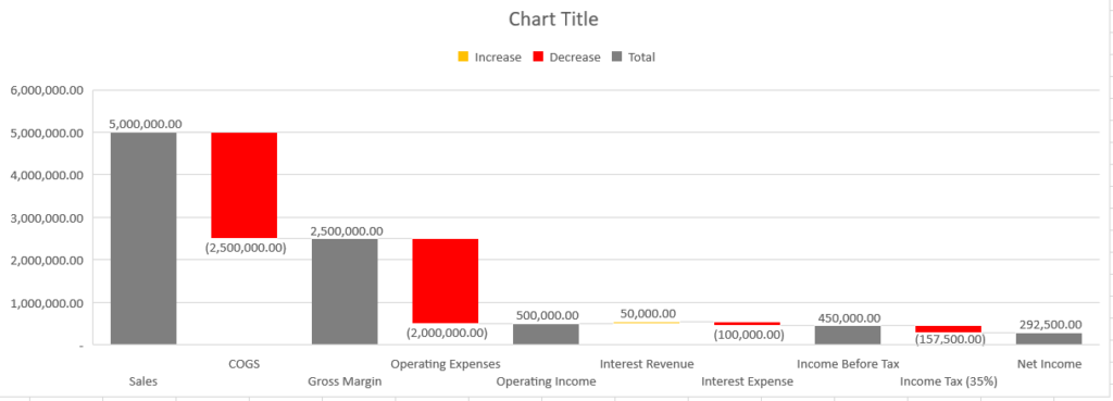
It shows the cumulative effect of a series of positive and negative values. You can use it to show the cumulative effect of sequential values.
You may also like:
- How To Delete Multiple Rows in Excel Sheet at Once
- How to do Indent Text in Excel Sheet
- How to Do Linear Regression Analysis in Excel
