Mobile view in Chrome
Mobile view is a feature that is provided by the developer tools plugin of Google Chrome. It is a tremendously useful feature for the application development team.
This feature is more useful for Quality Assurance (QA) teams while testing multi-platform web applications. Testing mobile view is a necessary component of test execution once the development is done.
For developers, it is used to check network latency, CSS-related issues, and different mobile views while developing a website or a web application. Mobile Responsiveness has become a prerequisite for the business. User Interface developers can debug the UI issues, Get and Post methods’ request-response structure and check the mobile view layouts in chrome. Last but not the least, it is embedded in the browser so that one can quickly fix the issues and verify the same in DevTools.
It is very easy to access mobile view in chrome. We will see how to access the mobile view in chrome later in this article. Mobile view in chrome is nothing but the different dimensions of screens in which the layout, styling, and other properties of UI elements are shown.
How is the look and feel of mobile view in chrome is possible with the mobile version of the website in chrome? All thanks to Google’s dev tools extension. All debugging is done via Developer Tools and chrome. For Web app developers, the tool has become essential without which it becomes difficult to debug UI elements of the website.
A mobile view of the website also helps you to catch important formatting and indentation properties that need change. You can quickly achieve this via DevTools.
Website Development – Mobile View in Chrome
Responsiveness of websites is an approach towards web design that allows web pages to present on an array of devices, windows, and lastly different screen sizes. These responsive layouts adjust and adapt automatically to different device screens or sizes be it a laptop, mobile, tablet, or desktop.
However, it is slightly difficult for software testers to perform responsiveness in design testing due to many factors that need to be looked at during the testing phase.
A unit test can also be done which can test a small unit of production code that may either pass or fail. It can prove powerful to ensure the good quality coding which can be achieved when during this test, developers can catch bugs when the website is still in its development stage. It becomes easier for them to find out the cause of the UI bug/issue using DevTools and fix it quickly and verify the resolution immediately. All thanks to Google Developers. The team at Google has developed this extension and made it public so that other developers can use its functionality fully and make their websites bug free.
Use cases – View the Mobile version in Desktop Chrome
Below are the use cases where website mobile view is used. The teams in IT are well versed with website mobile views.
Development Team
UI developers use mobile views in chrome while developing the medium to complex websites with HTML, JavaScript, and CSS. All the styling and properties of a web page are determined and experimented to make proper view in the page. While doing this, there are chances of mobile view break due to change in full web page views properties change. Chrome provides DevTools that are used by them to troubleshoot the issue and fix during the development.
Testing Team
Testing can be extremely handy when it comes to avoiding costly mistakes and also getting most productivity out of the development efforts. As a part of their test plan or test strategy, user interface is a part of text execution. Cross-compatibility browser testing, Mobile View testing and testing exceptions are some core activities of the testing team.
IT Operations Team
The IT operations team uses the DevTools for checking the HTTPS request and response if there is an SSL certificate related issue or any other issue related to the network or the website is not accessible in the network.
HelpDesk/Production Support Team
There is a team who is directly dealing with customers’ issues. Customers’ complaints related to Mobile View are logged to the helpdesk team and as the first level of troubleshooting, they can use Chrome DevTools to figure out the issue. On which UI action, the view breaks or alignment is broken or line spacing is an issue. This information is passed to QA and the Developer team to fix. The bug fixing process becomes faster with Chrome DevTools – Device mode.
Customers
Customers are the consumers of the website and apps. They are the best audience to check how strong or non-breakable the website is. They use the website freely and in a non-responsible way. The real test of a website is done by the customers. If the mobile view is breaking with the tiniest unit of UI elements, the customers will come up with issues to your help or customer service department.
Mobile Responsiveness in a Website
A responsive design helps automatically scale contents and elements to match the specific screen on which it is viewed in. One can avoid elements being larger than the screen width. This also helps viewers as it saves them from doing all the extra work in order to view the website’s content.
Website mobile view in turn helps the customers choose whether they want to go for the mobile app of the same website or not.
Chrome allows you to check mobile views of a website with the use of DevTools.
List the Mobile Views available in Desktop Chrome
Here are the mobile views that are available in desktop chrome. This list can be customized as well. You can add the device with screen proportions and ratios as per the specific mobile model you want to test.
- iPhone 6/7/8
- iPhone 6/7/8 Plus
- iPhone X
- iPad
- iPad Pro
- Surface Duo
- Galaxy Fold
- Blackberry Z30
- Blackberry PlayBook
- Galaxy Note 3
- Galaxy note II
- Galaxy S III
- Kindle Fire HDX
- LG Optimus L70
- Laptop with HiDPI screen
- Laptop with MDPI screen
- Laptop with touch
- Microsoft Lumia 550
- Microsoft Lumia 950
- Moto G4
- Nexus 10
- Nexus 4
- Nexus 5
- Nexus 5X
- Nexus 6
- Nexus 6P
- Nexus 7
- Nokia Lumia 520
- Nokia N9
- iPad mini
- iPhone 4
- JioPhone 2
- Galaxy S5
- Pixel 2
- Pixel 2XL
- iPhone 5/SE
As we discussed earlier, we will see how to access developer tools in the Chrome browser.
How to access DevTools in Chrome Browser
- Open your Chrome.
- In Windows, Chrome OS, Linux –
- Press CTRL + SHIFT + C keys.
- In Mac –
- Press COMMAND + OPTION + C keys.
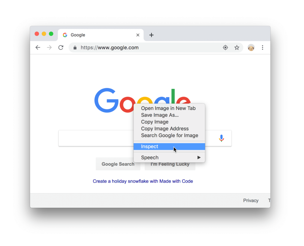
- In all platforms, open a web page, right-click and choose the Inspect menu.
To access Console directly –
- In Windows –
- Press CTRL + SHIFT + J keys.
- In Mac
- Press COMMAND + OPTION + J keys.
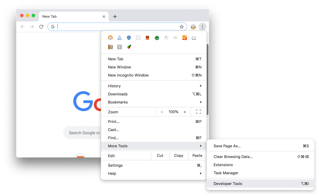
To access using the menu
- Click the 3-vertical dots icon on your web page.
- A menu appears. Click More Tools → Choose Developer Tools.
To access using the shortcut key
- In Mac –
- Press Fn + F12 keys.
- In Window –
- Press the F12 key.
For other shortcuts, please visit https://developers.google.com/web/tools/chrome-devtools/shortcuts.
By performing all the steps above, you can successfully access DevTools in Google Chrome.
To access using the terminal in Mac –
- Use the –auto-open-devtools-for-tabs flag as below.
| Applications/Google\ Chrome.app/Contents/MacOS/Google\ Chrome –auto-open-devtools-for-tabs |
How to View Mobile Version in Desktop Chrome (iPhone)
- Open Chrome’s developer tools with Fn + F12.
- Click the Toggle device toolbar button to turn the Device Mode on or off.
- Select which mobile device you want to stimulate.
NOTE: Please observe the device icon turned to BLUE in color that denotes the mobile view is ON.
- From the Responsive drop-down, choose the iPhone option.
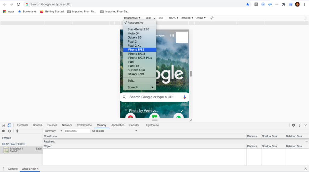
- You have quickly switched to iPhone mobile view. For viewing different screen sizes of models, select the options from below.
- iPhone 5/SE
- iPhone 6/7/8
- iPhone 6/7/8 Plus
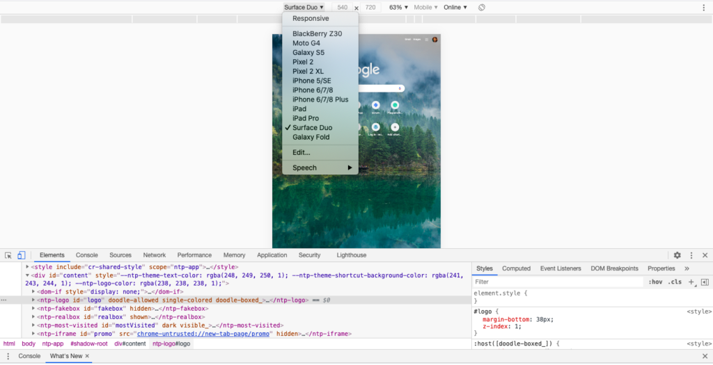
NOTE: Similarly, you can view Samsung, Moto, Mi and other device models from the Responsive list.
How to set custom Mobile View in Chrome
- Access DevTools.
- Switch on the Device Mode.
- From the Responsive menu, click Edit.
- View the console window below.
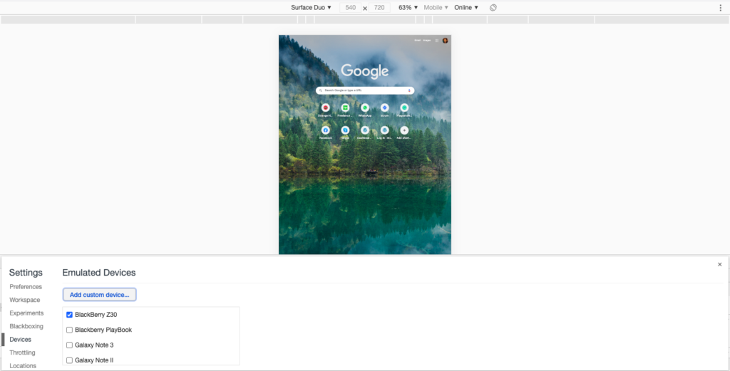
- Click the Add custom device button.
- First, look at the list of devices and select if the model you want to add is already available.
- By selecting the model, the view will be part of the Responsive list.
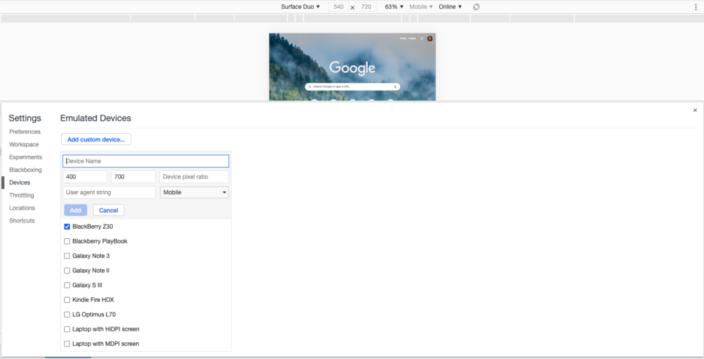
- If the device is not listed, perform the following steps.
- Enter the device name, for example, Samsung M30.
- Enter the dimensions in the pixel unit, for example 1080 x 2280.
- Click the Add button.
- The newly added device is a part of the list with the selected checkbox.
- The custom device Samsung M30 is added to the list of the Responsive menu.
After completing these the above, you’ll be able to use the different Mobile Views in Chrome using the desktop mode.
To get back to a normal website view, one can simply uncheck the same box. After doing so, the page will automatically refresh and load up its Website view.
To view each element selected and check the mobile view in Chrome, follow the steps below.
- Open the iPad mobile view. To do so:
- From the responsive menu, choose iPad Pro. The view appears as below.
- In the console window, you will see the icon highlighted in pink below.

- Clicking on it will turn it into blue.
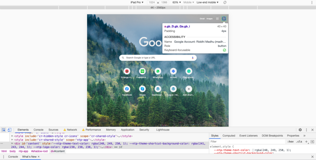
- Now, select any element on the website, you will see the details of that element. For example, in the screen below, you see the width and height of the view.
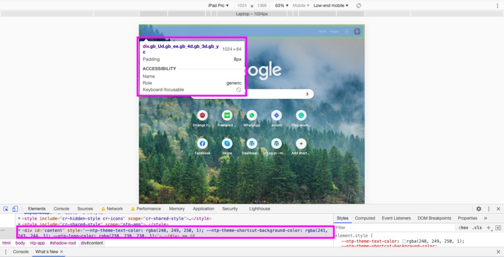
- The highlighted blocks show the property of the element selected.
- Whenever the developer wants to change any of the property values, he/she will need to double-click on the highlighted area shown in the console.
- Edit the value and see it is reflected in the mobile view.
- Once the value applied is appropriate, the developer updates the changes on the file located on the server and pushes the change into production.
This way, you can manipulate the mobile view properties and see the change reflected.
In case you had to do the manual work of checking the color properties of the heading, it could be a difficult task to find the property in the CSS file containing thousands of lines.
The DevTools plugin of Chrome makes life easy when it comes to changing the CSS properties of your Website.
Desktop Chrome is the best browser for debugging Mobile View
As Flex, JavaScript, Applets, AJAX requests, Flash, and many more client-side components may behave differently on the different web browsers with respect to their rendering engines.
A rendering engine is a part of a web browser that is responsible for presenting the content on various screen types. This content could be text, image, or any other graphical representation. So every browser manufacturer is it Chrome, Mozilla Firefox, Safari, etc. has its own rendering engine designed uniquely.
Mobile views in Chrome is the best tool under DevTools that helps developers and other IT teams to troubleshoot responsiveness in the Website.
Read: How to Enable Lite Mode in Google Chrome?
