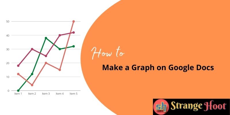
Many people need to make a graph on Google docs for project managers, program managers, analysts, and helpdesk teams. Graphs are helpful in visualizing the data from different perspectives and performing analysis for given data.
To make Graph on Google Docs
- Open the document Google Docs for the data report.
- Selection of graph:
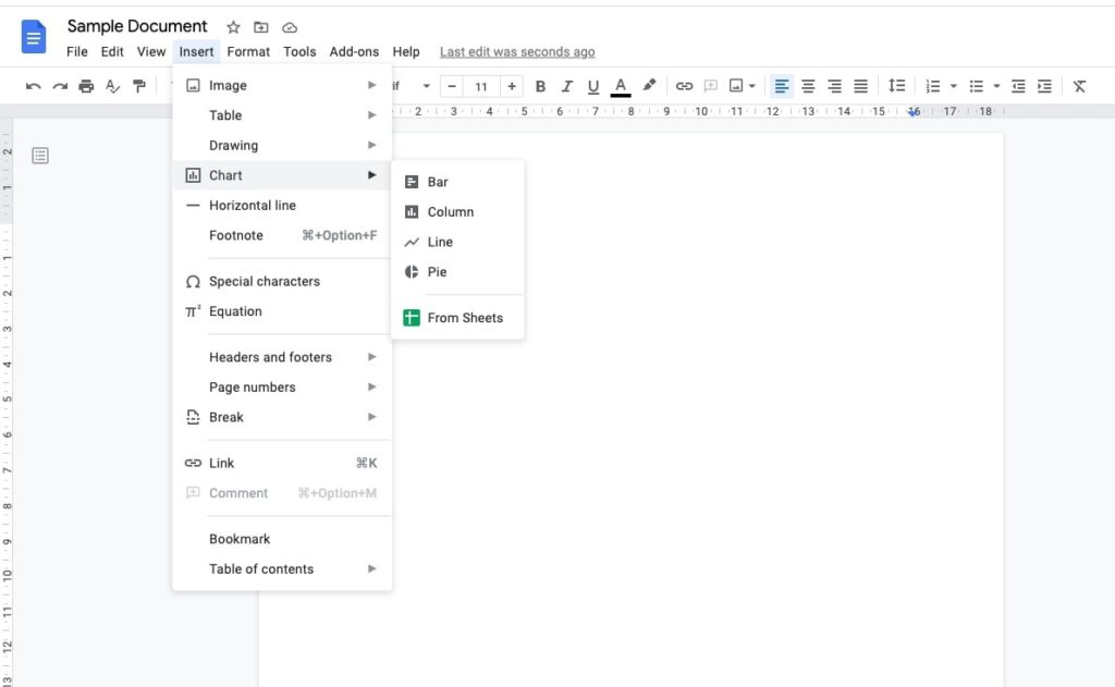
- Insert → Chart option. In this example, we have chosen “Bar”.
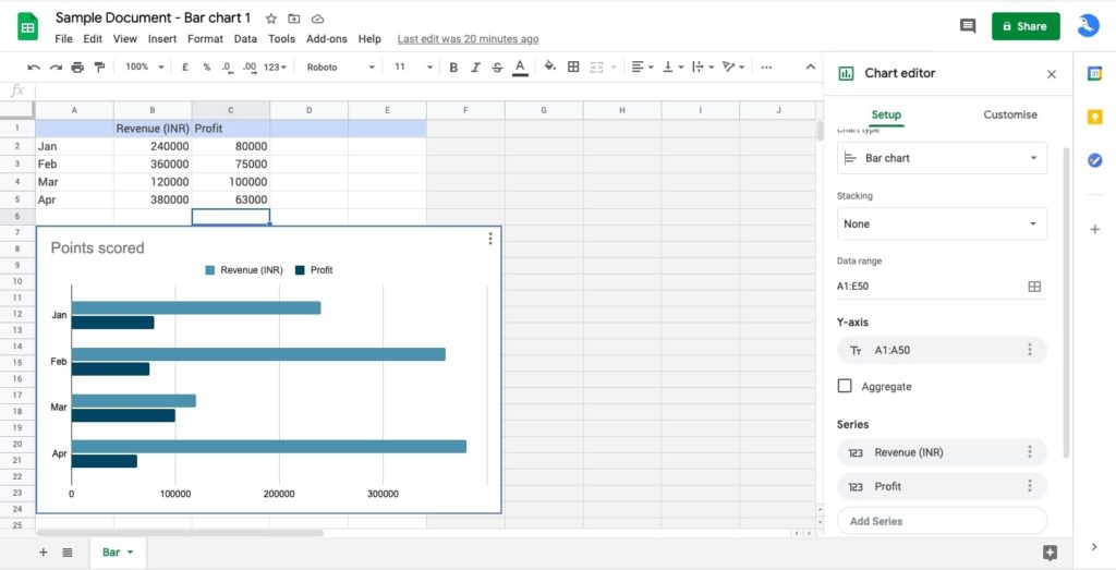
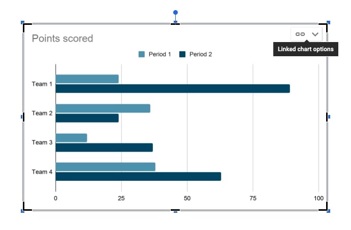
- Sample chart is plotted.
NOTE: The chart placeholder is not an Image. It is attached to the sample source sheet.

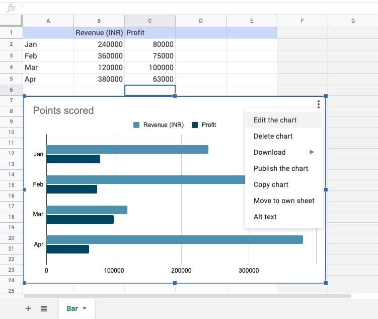
- Pick Linked chart options. Here is a list of options for the user.
- Choosing an Open source option will redirect to the dataset.

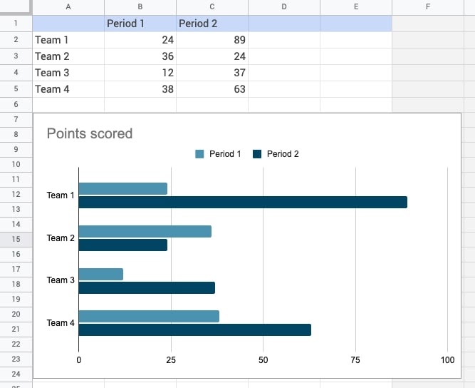
- Modify/Enter the data points and row headers as per data preferences.
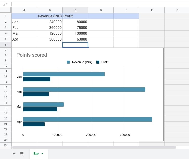
- Modified data:
- We have updated Columns B and Column C.
- We have updated the reference cells – A2:A5.
- The same data shall be populated in the Google doc by pressing Update.
- Chart is generated.
How to Change Chart Type in Google Docs
Opting for another chart type is quick and easy once the datasets are in place. It is another representation that the user would like to go for when it comes to analysis of data.
- Open the source datasheet as explained in the steps above.
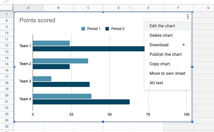
- The 3-vertical dots icon shall be used to open the menu.
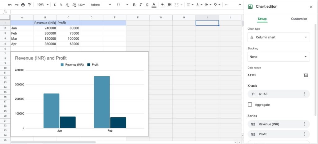
- The Edit the chart option can be used to open the right side panel for editing the chart.
- Locate the cursor where the Bar chart text/label is shown. Open the list.
- Explore the types.
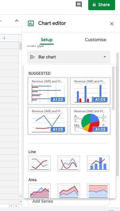
- Under the SUGGESTED section, the preferred chart type selection to be made. In this example, the Column Chart is selected.
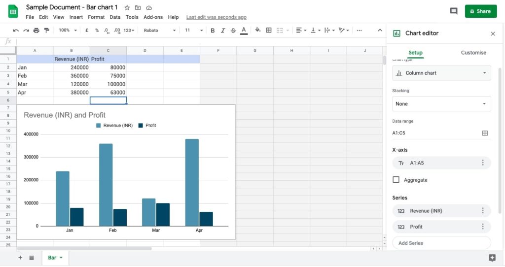
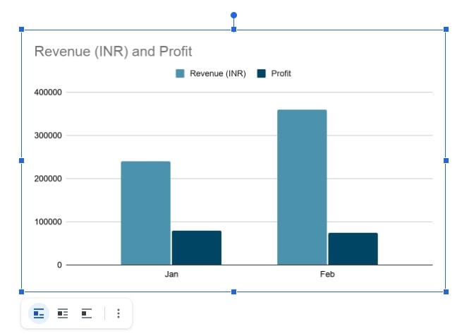
- The user will see the bar chart is replaced with the column chart (the same dataset).
- The user shall open the doc and refresh it by choosing Update.
- The results are available.
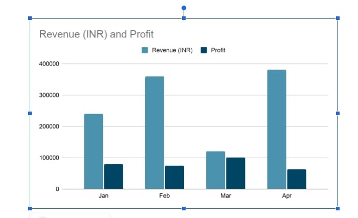
- Another chart type is ready to use.
How to Change Data Range of Graph
Making modifications in the data range is to do with the source data from which the chart is plotted. The user can increase or eliminate the data point(s) and accordingly, the chart will be refreshed.
- The Edit the chart option shall be chosen. The right side panel is shown.

- Use the table icon available on the Data range field. A pop-up appears.
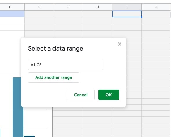
- Modify/Re-enter the range from A1:C5 to A1:C3. OK.
NOTE: The Add another range option can be chosen from the updated dataset.
- Go to the
google doc . Update to refresh the change. - Steps are done. Preview below.
How to Customize Charts In Google Docs
Customizing the chart properties are to do with changing formatting styles with respect to the background color, font, border, and many more.
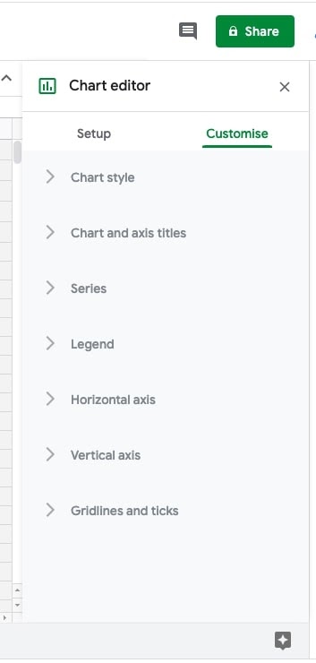
- Choosing the Edit the chart option will open the right side panel (Chart editor). Preview below.

- The panel has 2 sections. Setup and Customize.
- Opting for the Customize tab will get you the list of formatting properties.
- To apply changes in chart style:
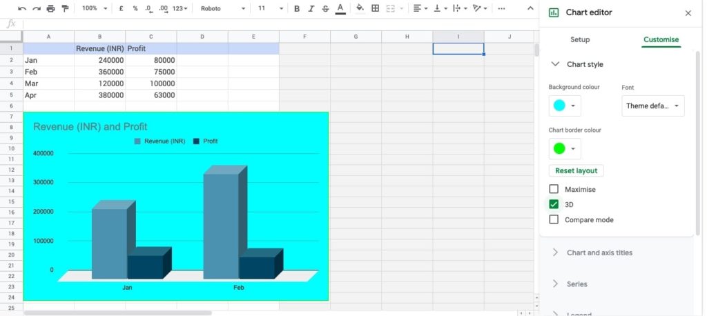
- Choosing Chart style expands with a list of properties.
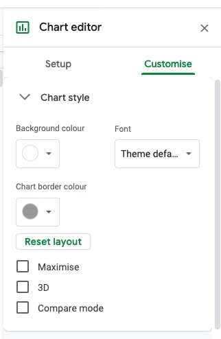
- Pick background color, font, border color, etc. as per the choice.
- To get a 3-dimensional view of each bar, tick 3D.
- Here are the results.
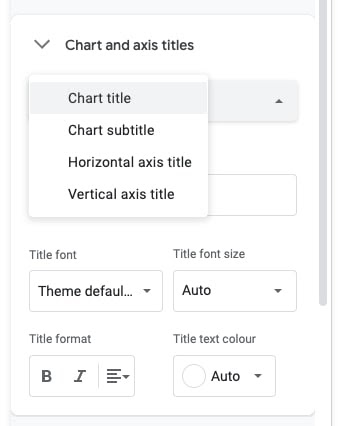
- To set up properties of chart axis and titles:
- The second accordion shall be clicked to expand. See details.
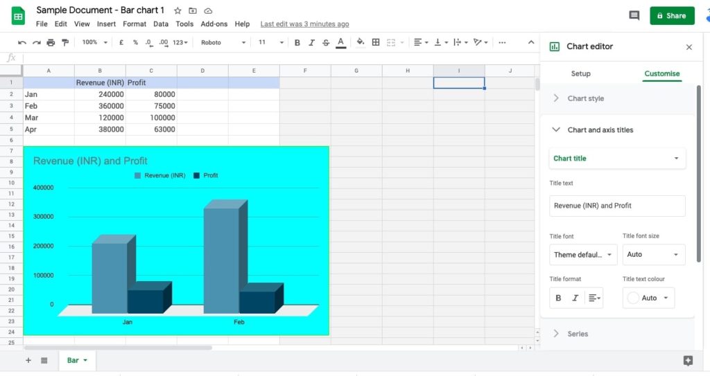
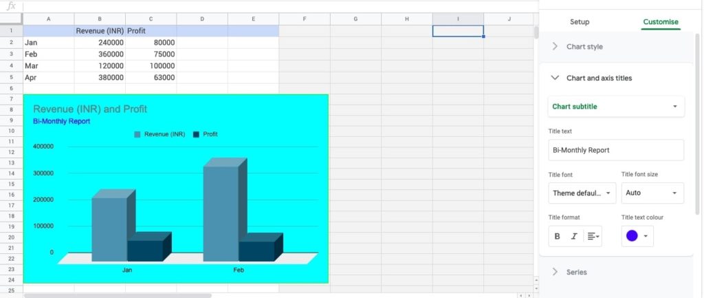
- Pick the subtitle item to give the subtitle to your chart.
- A text field with blank values appears.
- Enter the label for the sub-title.
- Change color, and alignment of subtitle, if required.
- Preview the results.
- To make Chart Series changes:
- Expand the Series accordian.
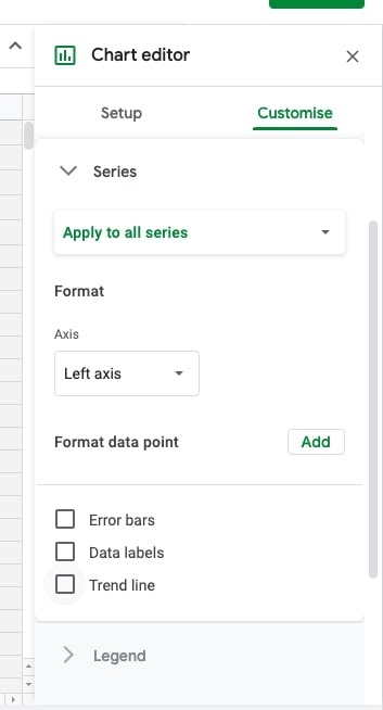
- Set a Trend line by ticking the checkbox.
- Pick the axis option.
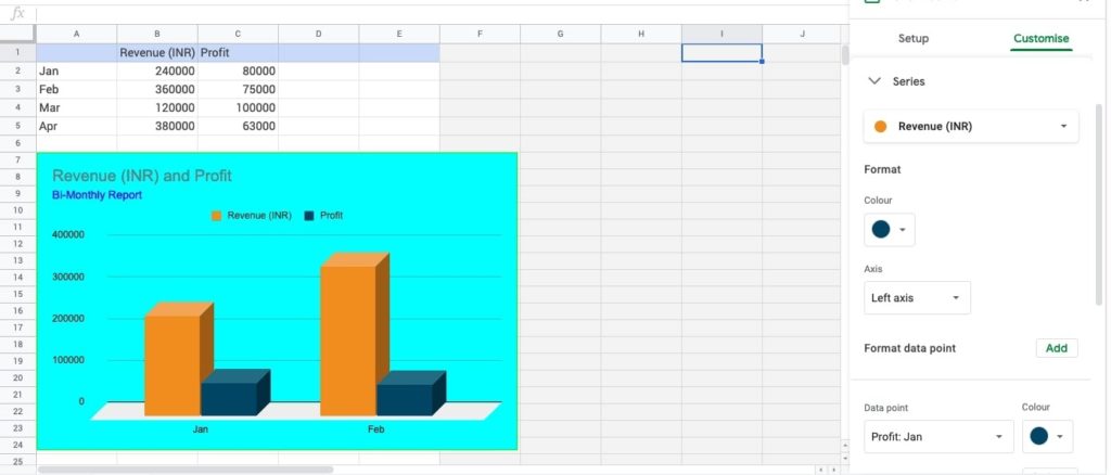
- To specify properties for a datapoint, pick Add to format data point.
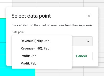
- Make a selection of the data point of which the user wants to set a different color.
- Preview the changes.
- To set up properties of the Horizontal axis:
- Expand the Horizontal axis accordion to view elements.
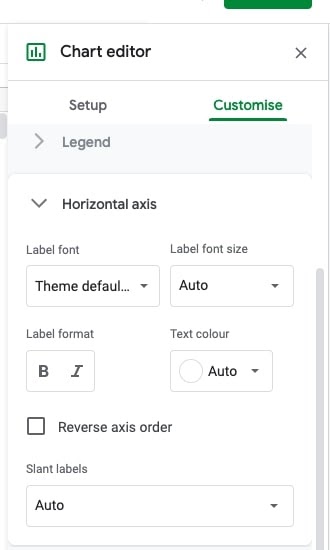
- The font size, format, text color, and label direction of the x-axis can be set as per the choice.
- To set up the vertical axis on Charts
- Expand the vertical axis item to modify the formatting.
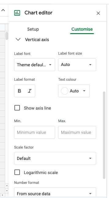
- The font size, format, text colour can be updated.
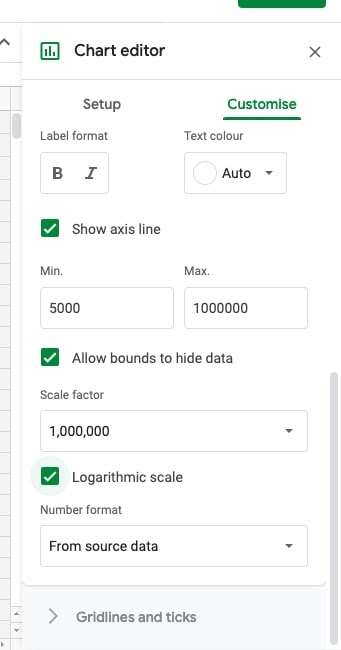
- Tick the Show axis line checkbox.
- Set the Minimum – Maximum values for Y-axis.
- Tick Logarithmic scale to make the values compact.
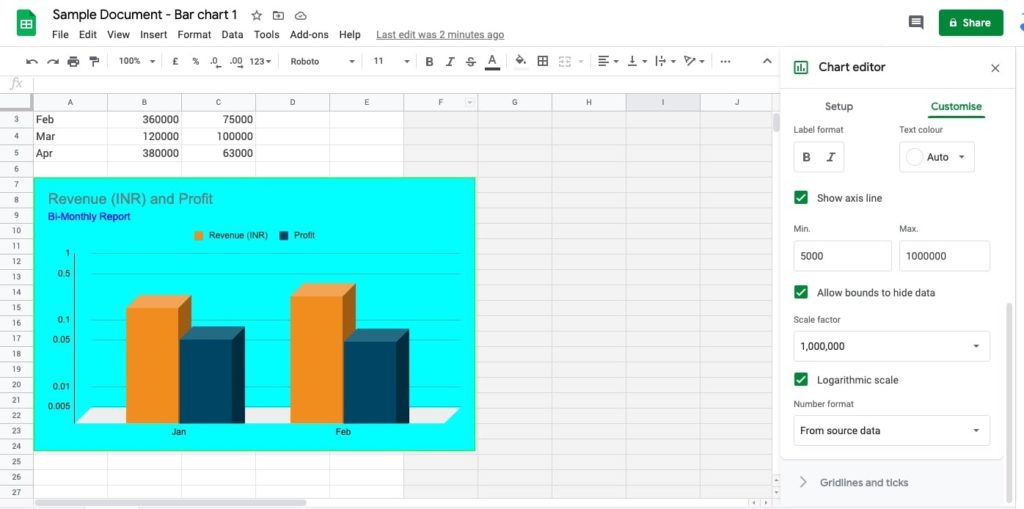
- Preview chart with changes.
- To add Gridlines and Ticks on Charts
- To expand Gridlines and Ticks, press the icon of the drop-down.
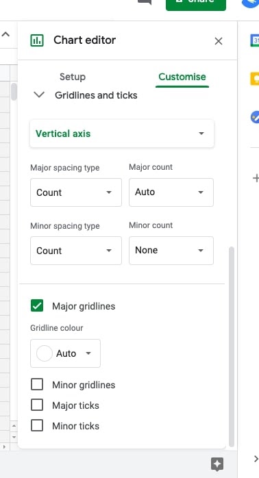
- The user will have Vertical axis-related properties.
- Spacing type for major and minor is something the user can set.
- Counts of major and minor can be updated with appropriate values.
- The color of grid lines can be set as per the preferred choice.
- Tick the box Minor gridlines. The user can set the color.
- Tick Major ticks. The user can set ticks’ position, thickness, color, and length.
- Tick Minor ticks. The user can set ticks’ position, thickness, color, and length.
- Preview the modifications.
- After customizations are done for all of the above components of the chart, one can go to Google Docs.
- Refresh the chart by using the Update button.
- We are done!
How to work with different types of Column charts
The stacked type of bar charts are used to view data in parts. The user/analyst can evaluate the datapoint(s) in a better way when it comes to view the dataset in the stacked boxes. We will see how to plot the stacked bar graph in Google docs.
- Open the doc.
- Make a choice of Chart item from Insert using the menu bar.
- Opt for the type of graph. In this example, we selected Bar.
- The user will see the sample chart plotted.
- Press the Linked chart options. The user will see the menu with below options.

- Opt for Open source. The datasheet opens up.
- Locate the 3-vertical dots icon. Using the mouse-click, open the menu.

- Pick Edit the chart. The editor is populated on the right side.
- From the chart type, select the type – 100% stacked bar chart.
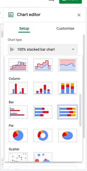
- The stacked chart is plotted with the percentage values on the horizontal (X-axis).
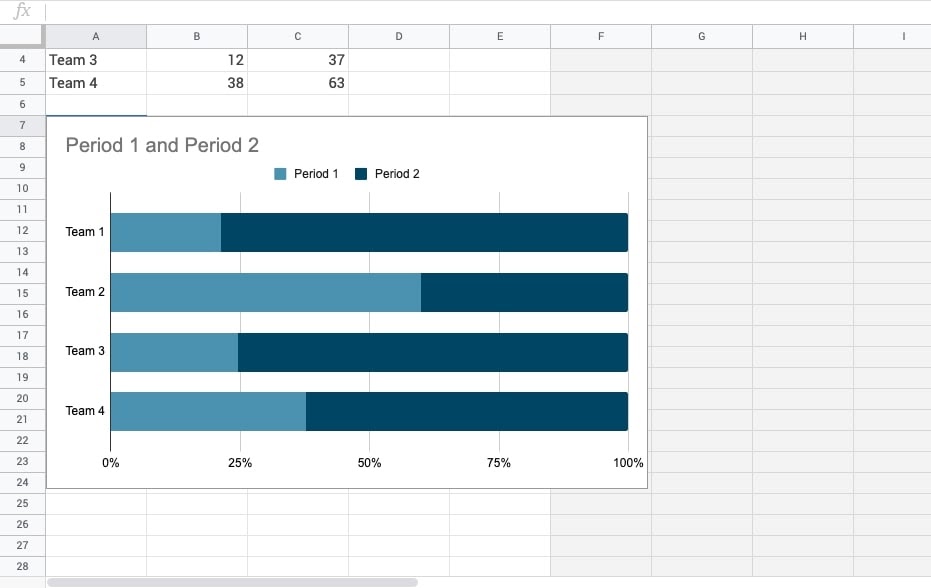
- Refresh by using the update on the chart available in doc..
- One will see the chart updated with the stacked bar chart.
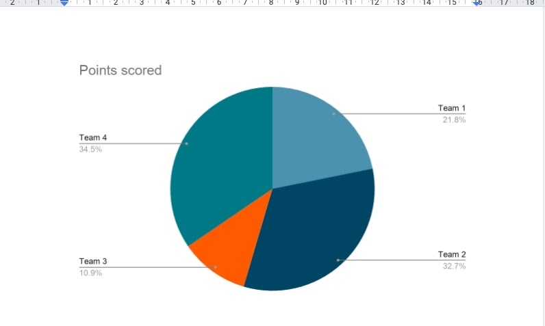
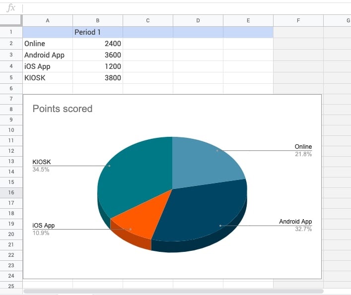
How to Create 3D Pie Chart in Google Doc
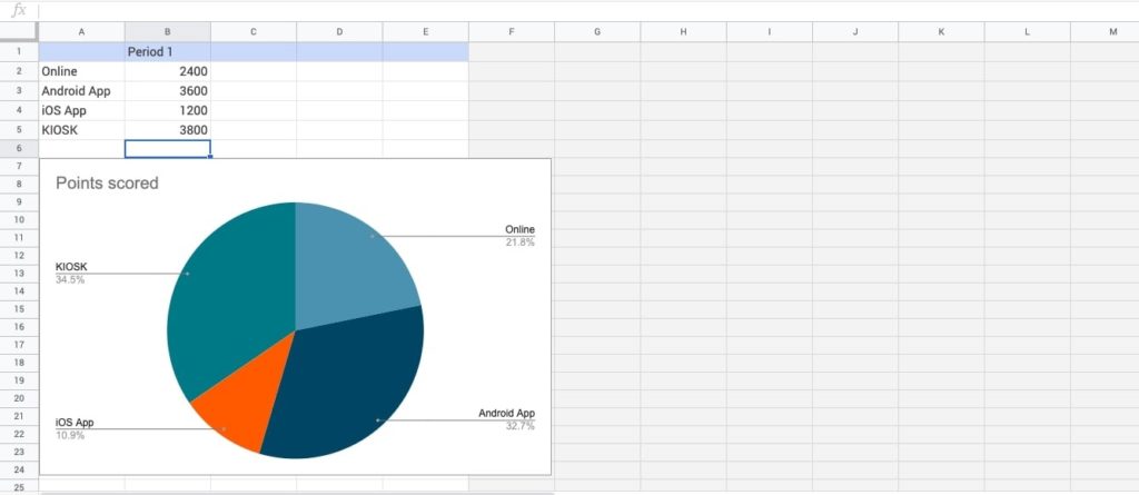
These graphs are easy to view the demographics of the population. To get the customer data who is using the product’s channels such as Website, Android App, iOS App, and KIOSK. Very easy to identify the growth of the business is seen in which product channel.
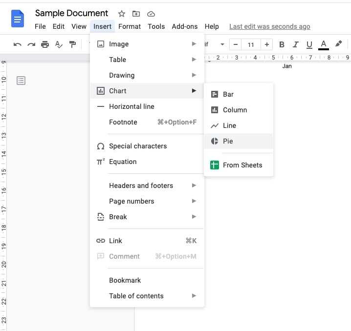
- Open Google Doc. Follow the menu options as Insert → Chart → Pie.
- The chart is plotted with a sample dataset.
- Pick the open source option using the link icon on the chart.
- The user will see the source datasheet.
- Enter the data segments as per the example given above.
- Use the 3-vertical dots icon to open the right side panel.
- Scroll down to view the Pie section. The third box from the left is a 3-Dimensional view of the pie chart. Go for it.
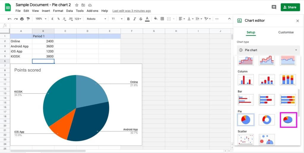
- The chart will be converted to a 3D view.
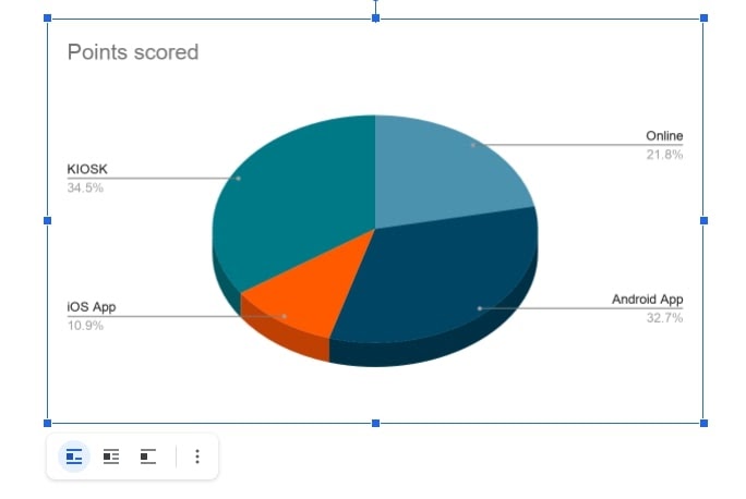
- Redirect to the google doc. Use Update to reflect the changes.
- Here the 3-dimensional view is live.
How to make a line chart from sheets
Google Docs provides an interesting feature to plot the graph by selecting google sheets.
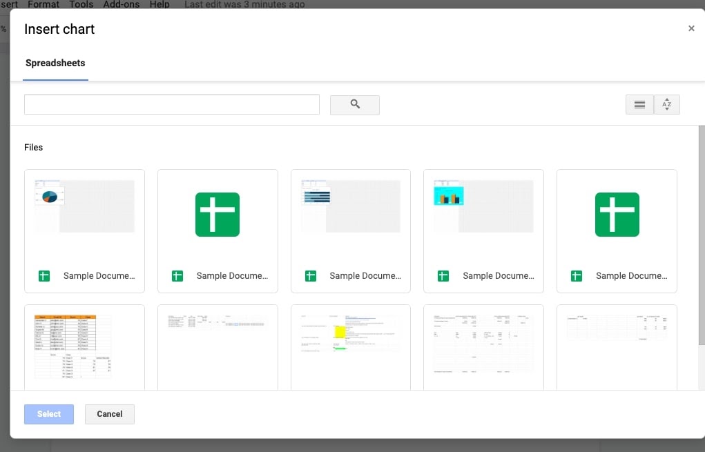
- Open Google Docs. Insert → Chart → From Sheets.
- The Google Sheets located on the drive will be shown.
- Pick the datasheet by clicking the file thumbnail box. The blue button (with select label) is activated. Press to insert the graph.
- The user will be redirected to the pop up.
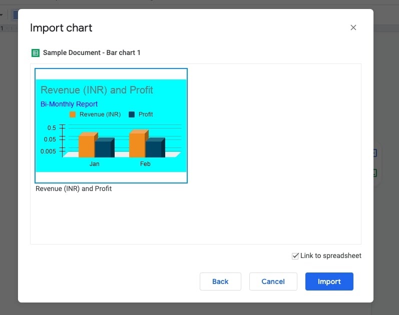
- Pick the graph thumbnail. The Import button is highlighted.
- Press Import. The chart will be opened in Google Docs.
- Go to the editor (the right-side panel).
- Make the choice of a line graph. The bar chart is replaced with a line chart.
- Opt for the Update button and see a refreshed view.
How to share charts
Post the report with graphs ready, there might be a need to share with the team for further discussions and to plan the strategies. Either they can be downloaded or published online. The choice is yours!
- Use the link icon on the chart plotted on the Google doc.
- Open-source. The data source will open with the chart.
- Use the 3-dot icon that is available on the upper right side of the chart. The options below shall be available.
- Make a selection of downloads and pick the format in which you want to save the chart.
- Pick Publish the chart to share with others online.
- Make a choice of the publishing options.
- We are all set for discussions on the data analysis and evaluation.
How to detach source sheet from Google doc graph(s)
After plotting the chart on Google Docs, one can easily de-link the chart from the source dataset. While sharing if the analyst wants to restrict the updating of data, it needs to be de-linked with the source. Simple steps to do so.
- Use the link icon on the Chart plotted on the Google doc.
- The options shall be available as below.
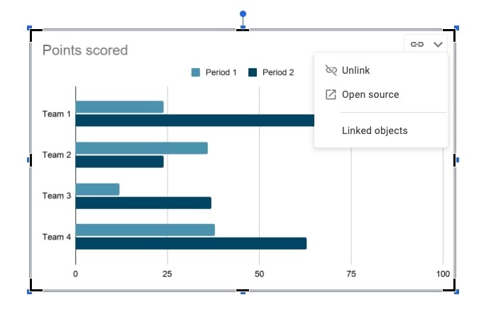
- The Unlink option shall be chosen.
- The user has detached the dataset with the chart plotted on Google Docs.
Examples
- Visual representation on submitting weekly, monthly, and yearly reports of revenue, sales targets, and so on. The graphs can be plotted to visualize trends, growth, or patterns in the data.
- View trends in stocks using the historic dataset
- Predictive analysis using scatter-plot charts to identify the relationship between 2 variables.
Analysts/project managers may choose to create / plot line charts, column charts, and different types of subtypes of the chart. Making the 3D view helps them to analyze the data as a model and evaluate the same. Line charts are helpful to view trends in the data. For data comparisons and time series, bar charts and column charts are used. Scatter-plot diagram is used to view the relationship between two variables. In regression analysis, the scatter-plot graphs are very very useful.
You may also like:
- How to Delete a Page in Google Docs in Various Ways
- How to Change Margins in Google Docs
- How To Delete Multiple Rows in Excel Sheet at Once
- How to Do Regression Analysis in Excel
