Microsoft Excel is an excellent tool for data analysis and visualisation. It is powerful in terms of getting data into place, performing calculations on data, creating pivots of the data and finally representing the same in the form of different charts.
Data analysis is an iterative and ongoing process. To find out spikes, skews, outliers in data, different types of analysis is done. As and when the analyst keeps adding the data into the sheet, the results may change.
When the analyst is working on the Excel sheet(s), the more time should be allocated to the thinking process and less time updating the data.
Updating data is referred to as editing Pivot graphs in terms of changing the data reference cells, formatting the data points and so on.
There are multiple ways of editing graphs in Excel.
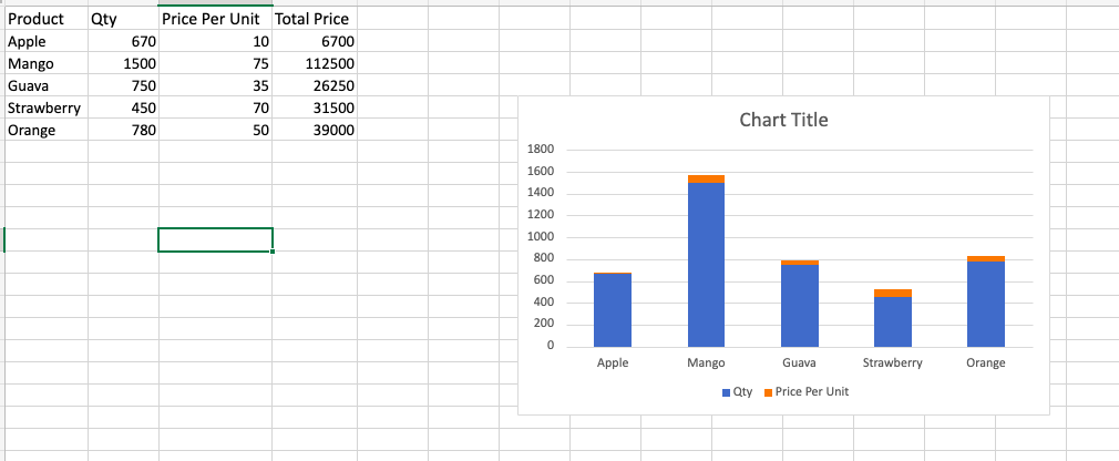
Sample Datasheet
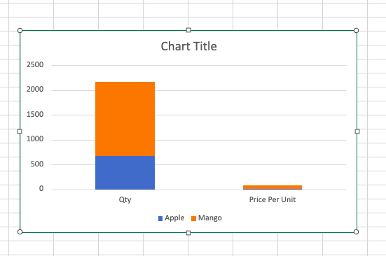
The sample datasheet contains 4 columns: Product Name, Quantity, Price per Unit and Total price. The graph is plotted with Products on x-axis and price per unit on y-axis.
Way 1 – Switch the datapoint to plot the chart
- Select the chart plotted on the sheet.
- The Chart menu gets activated with multiple options.
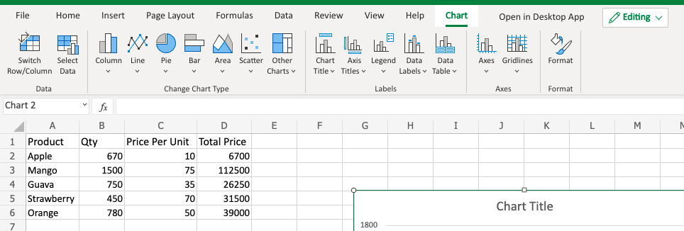
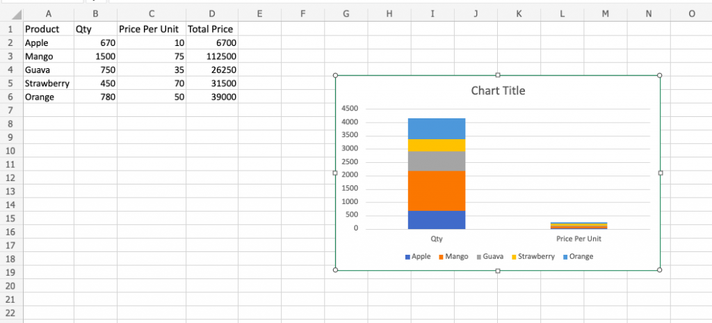
- To edit the graph, you can choose Switch Row/Column.
- See updated Graph.
- If you want to compare only Apple and Mango in the chart, click the Select Data. A popup is shown.
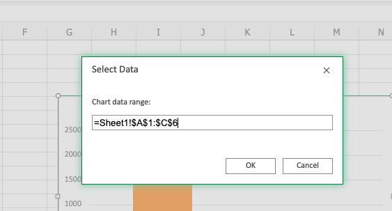
- Update the reference data range as =Sheet1!$A$1:$C$3.
- Click OK. See the updated chart.
Way 2 – Switch the chart type to update the chart
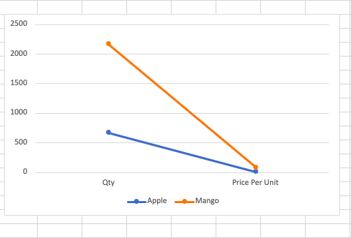
- To change the chart type, make sure the graph is selected.
- Choose any chart you wish to from the Change Chart Type section.
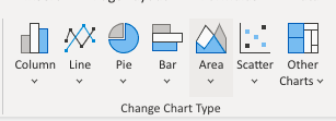
- You shall see the updated graph.
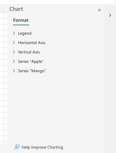
Way 3 – Update chart by changing the chart properties
- Choose the chart. The right side pane of Format shows up.
- To change units on axis, use the Axis and update the same.
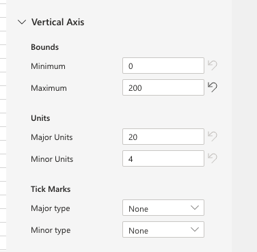
- Use the options to update the graph appropriately.
Takeaway
Microsoft Excel provides a variety of chart options for data visualization. It is quick and easy to use the chart once the datasheet is in shape. To analyze the plotted graph taking the parameters into consideration, MS Excel graphs are excellent in providing options.
Also read:
- How to do indent text in Excel
- How to delete multiple rows in Excel
- How to do linear regression analysis in Excel
- How to create waterfall chart in Excel
- How to round numbers in Google Sheets
- How to subtract in Google Sheets
- How to remove grid lines in Google Sheets
- How to use unique value function in Google Sheets
- How to create Histogram in Google Sheets
- How to make graphs in Google Docs
- How to make charts in PowerPoint
